
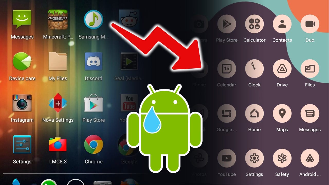
The Decline of Android UI
Android through the eras - analysis of it's design languages - comparison to iOS 26

I’ve generally like Android UI more than iOS UI. I’ve found it to be more aesthetic, more fun, unpredictable, and playful. Just a personal preference. Many people think iOS UI is better for a lot of reasons — the consistency, maybe it’s more fluid, maybe even more premium. And these are all valid arguments. I’m not trying to disprove any of these. It just in my personal opinion, I like Android UI.
Android and iOS UI through the eras
If we compare Android UI to iOS UI, starting from the oldest versions of the two operating systems, at this stage, both of them kind of looked pretty similar. And at this stage in mobile handset operating system design, there wasn’t too much differentiation. This was very much the skeuomorphic era, the Frutiger Aero era. The concept of UI design for mobile operating systems was just starting. And in my videos, this is sort of what I call the primitive era of Android UI design. And this era is probably where, in my opinion, iOS gets the closest to actually beating Android’s UI, in fact, I would say that it’s better.


We’re still in the early 2010s. We have the Pre-Holo era (Eclair, Froyo, Gingerbread) Then we have the Holo Era (Ice cream sandwich, Jellybean, KitKat). And at this point in time, iOS UI isn’t changing too much while Android UI seems to be changing rapidly year by year. And this is one of the reasons why I actually like the Android UI is because of this excitement, this unpredictability. I just think it’s fun. By the Holo Era, Android is starting, in my opinion, to look better than iOS. I just really like the sharp edges of Android UI. The colors are a little bit more robotic and spaceship-like… it feels a little bit more techy, and in my opinion cool.

 - CNET")

Now we are moving on to iOS and Android Lollipop. This is around the year 2014, and mobile operating system UI has already been around for a few moons at this point. It’s not in its early stages anymore, and things are shifting. In 2014, virtually everything starts getting flatter across the board, and I’m not even just talking about mobile operating systems — it’s sort of a worldwide trend. I couldn’t tell you exactly what sparked it, but I I have a theory that it could be a reactionary movement to the very glossy, very skeuomorphic era of Frutiger Aero, which was the design era right before it.
Now, it’s here where I believe Android really starts to shine with Android Lollipop. The Holo Era was definitely amazing, and a lot of people actually think that Holo was peak Android UI. And in a sense, I do agree with that. I think there’s a lot of that depth and 3D-ness that Android Holo had that sort of left to never return with Android Lollipop.
But realistically, for a modern device living in this world, I I think that the paper cut aesthetic and design language introduced with Android Lollipop (material design 1.0) really was a perfect balance between practicality and usability versus retaining that soul, that style, that pleasant and delightful UI. And it was at this time that iOS also changed from their older skeuomorphic look into the iOS 7 look — the flat, punchy, actually very nice looking design language that we still often see today. Although, and I’ll talk about this later, they are sort of changing their UI design language — Apple is doing some interesting things with UI nowadays. So is Android, and we’re going to get there…


But now we are back in 2014 and 2015, and at this point, I can say that although iOS does look really good, I believe that the Papercut-Era (Lollipop, Marshmallow, Nougat) really takes the cake. (No desert naming theme pun intended XD. And this is where Android really starts to shine. You start to have the layering of the material UI design, the different color schemes and themes. The font is really good. I really like the Roboto font. Apple has great fonts as well, but in contrast to Google’s fonts nowadays, Roboto is just a very nice font. It has that little bit of playfulness.. Even that robotic sort of name shows its digital sort of vibe. But at the same time, it was respectable. It was clean. It was easy to read, and practical. I’m a fan of Roboto.

So, we go through the paper-cut era, and it starts out pretty intense. Like when you’re using your phone, you’re using something that was made out of paper. And over the years, it sort of becomes less realistic. The paper theme sort of starts to fade away into more of just a digital sort of look with less shadows. The dimensions seem to sort of flatten out. And at this time, Android is pretty much material UI themed. And this is around 2017, 2018, 2019... I call this the no-nonsense era, and obviously the beginning of the no-nonsense era was a little bit more paper-cutty because that was sort of the transition time between the two design languages, and then towards the later 2010s and the beginning of the 2020s, the design language starts to become more digital, more minimal, with less shadows, and it starts to become more rounded.


Now at this time, both of the operating systems are in a very seasoned, more mature stage. And we see that while both of them have sort of peaked in practicality and usability, the look is sort of “no frills.” It’s very utilitarian. It was at this era too that I still think Android looked better than iOS. And one thing I didn’t mention before is the animations. I think Android animations are better. And this might really be a hot take because iOS is often praised for its animations. While it’s true that there are things on iOS that don’t compare on Android, for example, the really detailed animation you get when you connect AirPods to your phone, and things of the like.
But in general, I really like the system animations on Android. It just feels it feels snappy. I I want to say it feels a little bit more playful. There’s a little bit more charm there. I like how in Android when you get to the bottom of a screen to show that you’ve hit the end of the menu, at least on older versions of Android, the bottom of the screen would show a sort of bubble kind of thing to indicate to the user that you’ve reached the end of the menu. And it was just stuff like that, little embellishments throughout the animations, throughout the operating system that was just cute. I even think the mascot of the operating system, the Bugdroid, showed the charm, the sort of the fun of the operating system. And of course, the dessert naming scheme really adds to this flavor, (again, no pun intended), of the operating system, which just infused a little bit of fun, some soul, some charm, into the experience, making it more delightful, more pleasant.

And this is really a blend of UX and UI. We’re talking about the user experience, the psychology of how the user feels to use the product and how that is influenced by how said products are designed, how they’re named, and how they are even marketed — the Bugdroid mascot was used throughout many advertisement campaigns in Android’s earlier years.
So now, Android is sort of in a mature era. It’s in the early 2020's. The operating system looks good. I still prefer it over iOS in many ways. So, where does everything go downhill? You saw the title of the post, so you know that in my opinion, Android UI has been through a decline, a downfall if you will, and a rather steep one at that. I think I’m entering into controversial territory right now in terms of UI people, Android people, phone people. This may be a hot take, although I do know for sure that a lot of people agree with me on this — that I actually quite dislike the Material You introduced with Android 12. It feels like they are taking away a lot of what made Android such a pleasant experience. The colors are wonky. I think the weird fonts are just a little ugly, a little bizarre. I think everything just feels a little “on the nose.” It’s a little too… I don’t want to say babyish, but playful in a simple, dare I even say almost insulting kind of way. I just feel like it kind of got dumbed down.

There’s less customization despite the fact that they’re trying to sell it as more personable and more customizable. I think it’s actually the opposite. I think you could do more before with Android in terms of the UI design, and on a related note, Google seems to be getting rid of their customization other customization options having to do with Android besides the aesthetic of the UI. For example, there’s less options for sideloading, for rooting, for things that you can do with the actual operating system itself besides just what you can do in the UI. But that’s a topic for another time.
In my opinion, the downfall of Android UI started with Material You, and now there’s material design expressive, and really, it just keeps kind of getting worse. I’m just sort of waiting and holding tight for this era of Android UI design to come to a close, because as we see from Android’s history - from the primitive era, to the pre-holo era to the holo era to the paper-cut, to the no-frills and then to the material You, Android goes through phases and every three years or so, there’s a new design language. So, I’m kind of holding tight and waiting for this design language to be over. But for now, I’m almost ready to say that I think iOS actually just looks better than Android at this point in time. And this is the first time that I’m saying that in a while.
I think Material You is just really kind of a downgrade. And on a deeper level, I think it takes out a lot of the reason why people like Android so much in the first place. If people want a phone that is very fluid and easy to use, but also doesn’t let the user have so much control and kind of feels a little bit locked down, then there was iOS for that. And by the way, that’s a totally valid thing to want in a phone. There’s a lot of things I love about iOS, some of those things included, and it’s a great option. But that’s iOS’s niche. I think that Android just had a different niche and that was more techy people. People that wanted something a little bit more customizable, something you could fiddle more with, do more with. It just has that sort of connotation, that vibe, and it felt a little bit more fun, a little bit more… I don’t know, it’s hard to even describe.
Now, that’s not to say that Material You is all bad. I definitely don’t want to say that, and I don’t want to put any hate on Google or Android or anything in this episode. I really like Google as a brand. I really like Android. The Pixel phones are amazing. I just noticed something and I wanted to sort of put my ideas out there. It’s all subjective of course, and it doesn’t lessen my strong liking of Google or Android. Now that being said, and this isn’t the main topic of this article, but it definitely factors in, and that is: I don’t think iOS UI nowadays is all that good either. Rather, I would say that both of them aren’t so great right now.
If you take a look at iOS UI now, Apple’s done something strange as well, giving the UI sort of a mini overhaul when it really wasn’t necessary. There’s a lot of theories for why they could’ve done this. Some say it was a way to distract the public from their sort of flop with AI, and they were using the excitement and distraction of the new design language as, if you will, a sort of cover up. But I will say that their new design language and overhaul does feel just kind of bizarre, a little bit un-Apple. First of all, it’s not very consistent across the operating system. There are some things that have the new glass-refracted, bubbly-reflective kind of look. “Glassmorphism” if you will. It seems like it’s sort of a nod to Frutiger Aero. I think there’s a possibility they decided to do it like that on purpose because they know that there’s a little bit of a comeback with that design language, a grassroots sort of nostalgia for it.

For now, I will say that I’m not a huge fan of the translucent kind of neomorphic glass sort of look. There is more texture. There is more depth. But in my opinion, it’s not that people are like, “Oh, depth. It’s good. Oh, 3D = amazing.” No, I think that if it’s aesthetic, if it’s pleasant to look at, if it’s easy to use, then that is what makes a design likable. Simply adding shadows and dimensions everywhere, well, that’s not everything. And it seems like this new version of iOS has the shadows, the overlapping textures, it has even more of a skeuomorphic vibe. Just take a look at the new camera application icon. It has all of the factors that me and a lot of other people talk about in terms of the good old days and earlier design languages.
But if the use factor is missing, if the cohesive and consistent factor is missing, then it really like doesn’t matter too much. It’s not those specific design traits that we’re all like striving for, that we’re all craving for. It’s the whole holistic experience of using that operating system. It seems like we’re in a little bit of a low point in mobile operating system UI design. And it’s probably just a little dip that we’re going to get out of soon, and hopefully there will be new styles and designs to come that are even better. Another thing about iOS, is that all of the added textures and shadows and just stuff seems to kind of slow down some older systems, and can make things a little bit more choppy, which is also not a good thing.
At the end of the day, it’s not all about UI. UX is also half the story. And what makes a good UI, a pleasant UI, is one that doesn’t sacrifice usability for aesthetics — because then just look at a picture of it, right? The fact that it’s a UI means it also has to have good animations and flow well. And not to say that iOS is bad in any way. It’s obviously great operating system. It’s iOS. I mean, it’s hard to mess up iOS. It’s very solid. But I’m just being a nit-picky internet person right now and just giving my opinions.
It feels like we’re in a very interesting era of mobile UI design, and I don’t know where we’re going next. I will say though, that it seems like there’s an open spot on the market where the old Android used to be.
Watch the video here:
-Undefined